


🥁 boots and cats and boots and cats,
Work About Resume Contact
Product Designer · Bengaluru · 6+ Years

Good design survives a bad day.

Also: dancer, beatboxer, photographer Different instruments. Same discipline: rhythm, restraint, knowing what to leave out.

Late deliveries, dead stock, cancelled orders. I design the post purchase moments where enterprise retail loses people, and the flows that win them back.

Companies & clients I've designed for
Lowe's
Fortune 50 · Retail
GSK
Global Pharma
Simplilearn
EdTech
Metafic
B2B · Logistics
Biba
Fashion · E Commerce
Manyavar
Fashion · E Commerce
Wunderman Thompson
Agency · Consultant
Selected work · 2022 to now

Real problems.
Real stakes.

Adarsha R
About me

Designer by trade.
Performer by instinct.

Six years designing for Fortune 50 retail, global pharma, and fashion e commerce. Research led, outcome oriented, allergic to design that only looks good in a portfolio.

Read more →
Selected feedback

People I've
built with.

"

I had the pleasure of managing Adarsha on Lowe's Bottom Funnel team, focused on cart, checkout, and post purchase, some of the most critical touchpoints in the customer journey. He's the kind of designer every team hopes to have: reliable, collaborative, and always thinking about how to make things better for the customer. While much of the team was deep in a multi quarter initiative, Adarsha was the steady engine that kept day to day work running at a high level. Polished designs, proactive check ins, and a sharp eye on stakeholder alignment. Simply put, the success of our team wouldn't have been possible without his dedication.

JA
Jeff Anscomb
Senior Manager UX · Lowe's
"

Adarsha joined at a point where our research platform needed real UX rigor. The data was dense, the users were scientists, and there was little room for guesswork. He took the time to understand the domain before designing a single screen, and it showed. His work on our shared component library cut down rework across the team, and he was always the first to flag when a shortcut would cost us later.

SG
Sagar Goda
Product Manager · Excelra (GSK)
"

Adarsh, I tried to find an illustration of just one of the countless gods and goddesses whose backstories you've shared with us for every Indian festival, no luck. So here's a Japanese Maneki neko instead, for good luck and prosperity! Thank you for carrying the torch on post purchase work that never ceases. Your collaboration across business, product, legal, and engineering is always well orchestrated, and your UX design both solid and thoughtfully executed

CR
Christine Rassi
Lead Product Designer · Lowe's
"

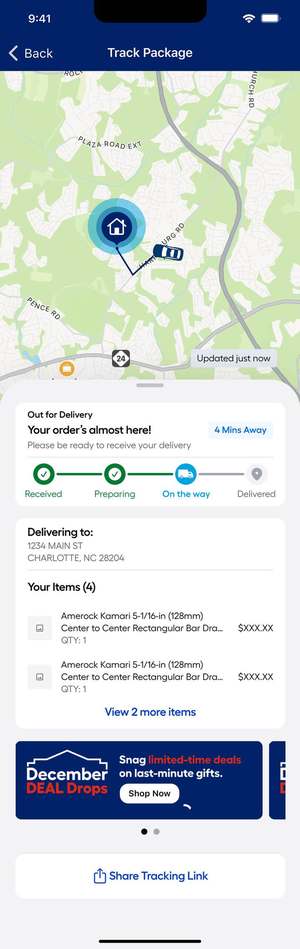
Adarsh designed an intuitive, customer centric live tracking experience by synthesizing inputs from product, business, and engineering. Translating complex real time logistics data into a simple, usable interface. Its reusability across post purchase communications and store systems has made it a foundational pattern across the ecosystem, improving clarity and contributing to higher delivery satisfaction and fewer contact center calls. Over the past two quarters he's contributed to Marketplace returns, fulfillment delivery services, and cancellation refunds, not just solving individual problems, but helping establish the north star for post purchase touchpoints.

KA
Kaveen Anand
Product Manager · Lowe's
"

Adarsha and I worked closely on Metafic's homepage and lead gen redesign, and what stood out was his instinct for tying design decisions to actual numbers. Every choice was framed around what we could test and measure. He brought structure to a fairly open ended problem space, moving comfortably between B2B dashboards, logistics tools, and growth facing pages without losing sight of the end user. Easy to collaborate with, and someone who pushes for the right outcome, not just the more polished screen.

SB
Surya Balaguru
Lead UX Design · Metafic
Open to full time · contract · consulting

Let's build
something that lasts

adarshr49@gmail.com
← All work

01 / 04 · AI Assistant · Lowe's · 2024 to present

MyLow: the AI that knows your house

End to end conversational UX for a Fortune 50 retailer. Customers arrive uncertain and leave confident.

Role
Lead Product Designer
Team
PM, 2 designers, ML/eng, content
Platforms
iOS · Android · MWeb · Desktop
Timeline
Jul 2024 to present
Key outcomes
  1. 01GenAI prototyping produced 3× more validated design variations per sprint
  2. 02Scoped follow up chips reduced misrouted intents. Faster path to confident purchase
  3. 03Inline product cards tied advice and buy action in one conversational moment
  4. 04Graceful handoff improved trust scores most, the feature most teams skip

01 / 04 · AI Assistant · Lowe's · 2024 to present

MyLow: the AI that knows your house

Lowe's customers don't want search results. They want someone who knows that a 2009 dishwasher needs a different part than a 2021 one. I led end to end UX for MyLow. Built to give that kind of answer at scale.

Role
Lead Product Designer. End to end
Team
PM, 2 designers, ML/eng, content design
Platforms
iOS · Android · Mobile Web · Desktop
Timeline
Jul 2024 to present
Cover imageReplace with Figma export. 2400×1200px
Why this matters

Not a prettier chatbot.

This affected millions of Lowe's customers navigating high stakes, high anxiety purchases. A wrong part means a second trip, a cancelled installation, or a flooded kitchen.

The goal was dual: deflect support load AND improve customer confidence. That two sided brief made this one of the most constrained projects I've worked on.

01, The brief

The project started as one thing. Became another.

Original brief

"Add an AI assistant. Help customers find products faster."

Before designing a single chat bubble, I asked: were customers failing to find products. Or were they never confident enough to commit? That question changed everything.

Customers weren't failing at finding products. They were failing at trusting their choice. The solution became: an assistant that interrogates gently, surfaces evidence, and never bluffs.

02, The user

Meet Priya.

👩
Priya Menon, 38
Homeowner · Sunday · sink is leaking

Searched "faucet leak." 847 results. Closed the app. Called a plumber. Paid ₹3,200 for a ₹600 part. Competent. Willing. Just didn't trust she'd pick the right part.

Priya is the modal Lowe's customer. Not confident enough to commit. Traditional search doesn't close that gap. Two questions and one part with a 98% fit badge does.

03. Research

I sat with people who answer these questions for a living.

Research across customers mid project, store associates (the human version of MyLow), and support agents. Every insight mapped to a design decision:

Finding

"I don't know what the part is called". Most common customer response

Decision

Scoped chips replace open text. "It's leaking" not "Moen 1222 cartridge."

Why

Match customer vocabulary. They know the symptom. Not the SKU.

Research documentation / affinity mapReplace with Figma export

04. Design exploration

Three directions. One right answer.

Option A
Open chat

Free form text. Maximum flexibility.

Rejected → Same problem, different box.
Option B
Guided recommender

Filter questions → product list.

Rejected → Still not advice.
Chosen ✓Option C
Conversational + inline

Chips → diagnosis → product card with fit confidence.

Advice and purchase in one breath.

Options A / B / C prototype comparisonReplace with Figma export

05. Final screens

Every screen answers three questions.

Problem. Decision. Why it matters. If a screen couldn't answer all three, it didn't ship.

Screen 01. Conversation entry

Entry stateReplace with Figma export

Problem
Empty chat box. Full cognitive burden on someone who doesn't know product names.
Decision
Scoped situation chips. "It's leaking," not "Moen 1222 cartridge."
Why
Anyone can describe their problem. Not everyone knows the SKU.
Screen 02. Follow up & diagnosis

Follow up flowReplace with Figma export

Problem
Open chat asked for specifics users didn't know. Make, model, part name.
Decision
2 to 3 chips narrow intent. MyLow does the scoping, not the user.
Why
"Drips when on" is answerable. "Moen Adler 87316" is not.
Screen 03. Inline product recommendation

Product card with fit confidenceReplace with Figma export

Problem
Previous flows separated advice from purchase. Two separate moments.
Decision
Product card with fit confidence, price, and stock renders in the thread.
Why
Advice and buy in one breath. The way an associate hands you the part while still talking.
Screen 04. Graceful handoff

Handoff stateReplace with Figma export

Problem
Low confidence → guessed wrong or generic error. Both destroy trust.
Decision
Below threshold, MyLow admits it and offers a human route or store visit.
Why
Trust is the product. One confident wrong answer in home improvement can mean a flooded kitchen.
06. Trade offs

Five I'd defend.

01
Scoped chips over open text

The bet: less flexibility = more completion. Intent accuracy improved significantly.

02
Deterministic logic over fully generative

The bet: rules based narrowing is safer and auditable. Generative v2 came after trust was established.

03
One recommendation, not a shortlist

The bet: single opinionated pick beats comparison list. Add to cart rates higher with one card.

04
Explicit handoff over graceful degradation

The bet: admitting uncertainty builds more trust than always answering. Handoff state scored highest.

05
Invest in streaming state design

The bet: in progress experience affects perceived quality. Thoughtful streaming scored higher than instant pop in on identical answers.

07. Impact

What changed.

more validated design variations per sprint via GenAI prototyping
measurably shorter ideation cycles
self service confidence and resolution in testing

MyLow shifted how the team thought about the assistant. From "bolted on chatbot" to a decision making layer across the whole shopping journey

08. Reflection

Honestly.

What surprised me: the hardest problem wasn't the AI, it was teaching people to trust it. The graceful handoff did more for adoption than any clever flow.

What I'd do differently: instrument conversation quality metrics from day one. Hallucination rate, recovery from misunderstanding, time to confidence. Those are the real UX metrics in an AI product.

The uncomfortable question: when does a personalised assistant become a filter bubble? I don't have a clean answer. Worth someone asking.
Next case ↗

Keeping the sale when fulfillment falls through

Let's talk

Liked what you read?

adarshr49@gmail.com
← All work

02 / 04 · Lowe's · Fulfillment & Order Recovery · 2024 to present

Keeping the sale when fulfillment falls through

Most "cancelled" orders at Lowe's weren't customers changing their mind, they were customers giving up because a late delivery or an out of stock pickup left them with no other option. This is the flow that gave them one. Before they ever reached the cancel button.

Role
Product Designer. Cart, Checkout & Post Purchase
Team
PM, engineering (web + chat platform), fulfillment ops, design
Scope
Web + MyLow chat agent. Fulfillment switching
Status
Shipped, measured across FY24 to 25
Key outcomes
  1. 01Reframed the problem. Most "cancellations" were customers giving up because their fulfillment method broke down, not because they'd changed their mind
  2. 02Built two mirrored flows, Truck Delivery ↔ Pickup and BOPUIS ↔ Same Day, surfaced at three separate moments, on the order page, mid cancellation, and when an item goes out of stock
  3. 03Shipped the same flow inside the MyLow chat agent, not just the web UI, so a cancellation started in chat could resolve there too
  4. 04$28.6M in recovered orders, plus a 100bps lift in Omni Fulfillment LTR on both workstreams

02 / 04 · Lowe's · Fulfillment & Order Recovery · 2024 to present

Keeping the sale when fulfillment falls through

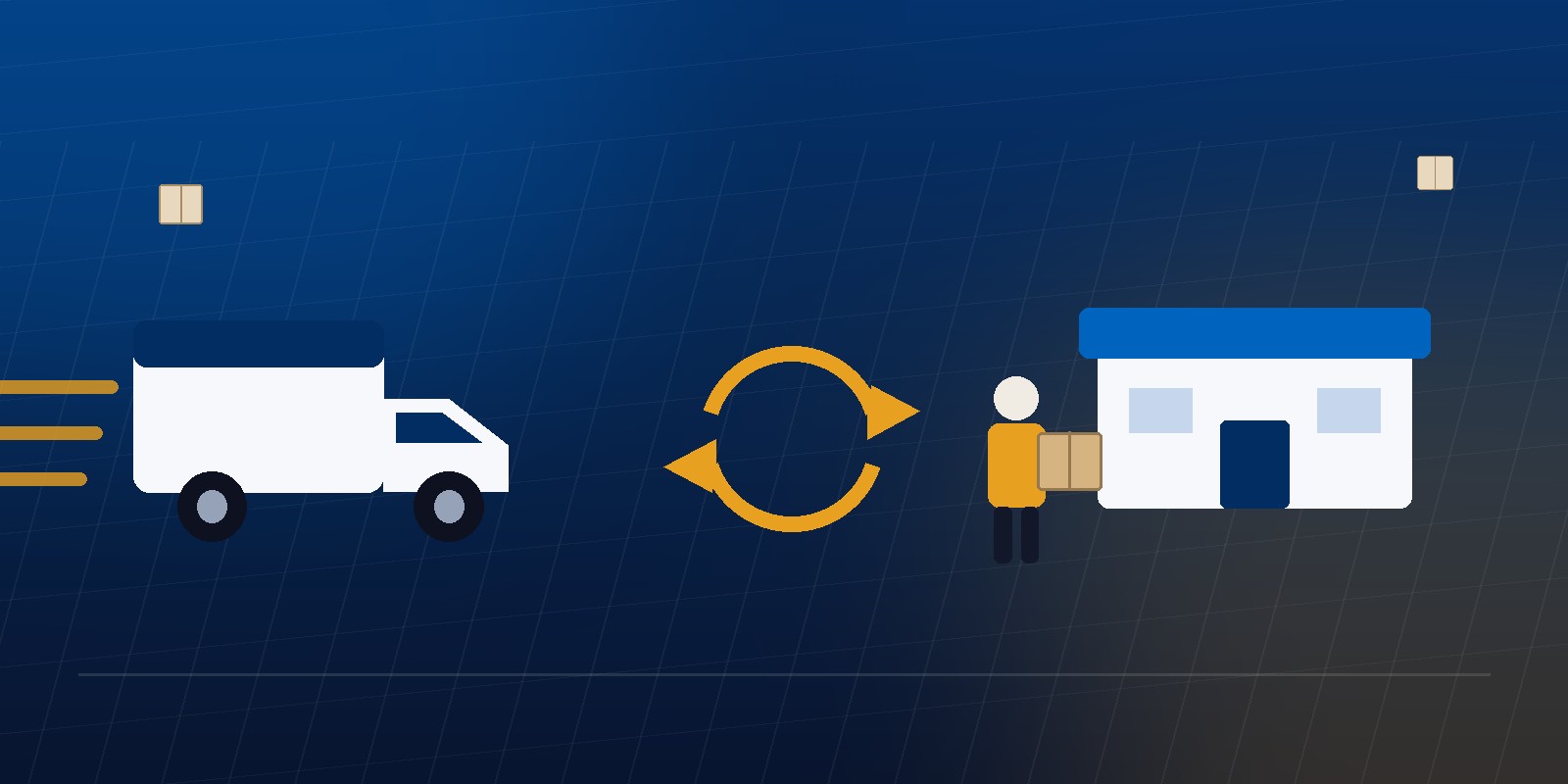
Lowe's was losing tens of millions of dollars a year to a very specific kind of cancellation: not customers who didn't want the product anymore, but customers whose truck delivery was running late, or whose pickup item had gone out of stock, or who simply couldn't get to the store in time, and who had exactly one option left on the order: cancel. I designed the end to end flow that gave them a second option, on the web and inside the MyLow chat agent, across two mirrored directions: delivery to pickup, and pickup to same day delivery.

Role
Product Designer. Cart, Checkout & Post Purchase
Team
PM, engineering (web + chat platform), fulfillment ops, design
Scope
Web + MyLow chat agent. Fulfillment switching
Status
Shipped, measured across FY24 to 25
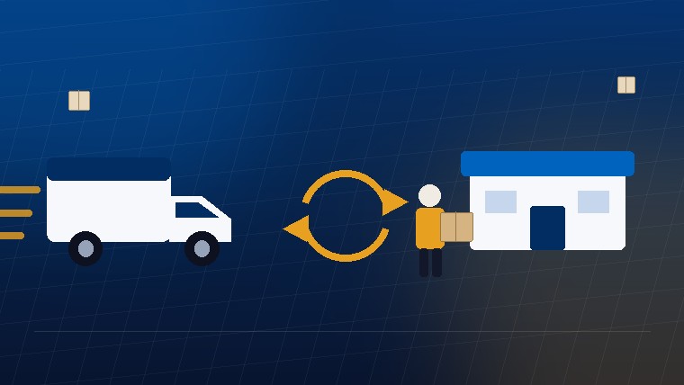
Delivery truck and in-store pickup, connected by a switch
Why this matters

A cancel button was doing a delivery problem's job.

The numbers made the shape of the problem obvious once you lined them up. In FY24, self service cancellations of truck delivery orders for item replacement reasons alone came to $44.5M. BOPUIS abandonment cancellations were $47.8M in FY24 and already $30.3M through week 32 of FY25. BOPUIS out of stock cancellations were $59.2M in FY24 and $19.5M in FY25 YTD. And going back to FY23, "items would not arrive on time" alone accounted for $41.03M in cancellation driven losses.

None of those are the same problem, but they share the same shape: a customer's fulfillment promise broke: late truck, missing pickup stock, a store they couldn't reach, and the only tool they had to respond with was a cancel button. There was no way to say "I still want this, just get it to me differently."

01, The brief

The ask was "reduce cancellations." The fix wasn't about cancelling less.

Original brief

"Reduce self service cancellation rate across delivery and pickup."

Framed that way, the obvious moves are the usual ones. Better delay communication, friendlier cancellation copy, maybe a retention offer. None of those touch the actual driver. The cancellation reason data showed customers weren't unhappy with the purchase; they were unhappy with the one fulfillment method they'd been locked into. The fix wasn't to talk them out of cancelling. It was to give them a working alternative before they got to that screen.

That reframe. From "stop the cancel" to "offer the switch" set the shape of everything that followed.

02. Two directions

One flow, mirrored two ways.

The work split cleanly into two tickets, each solving a different half of the same problem:

Truck Delivery → Pickup

For orders running late or perceived to be running late, let the customer switch to picking the item up at a nearby store instead of waiting. Or cancelling.

BOPUIS → Same Day

For pickup orders where the item went out of stock at the assigned store, or the customer couldn't get there, offer same day delivery, a fulfillment speed that didn't exist in this flow yet and had to be introduced end to end.

Same Day → BOPUIS

The reverse path, a customer who started down same day delivery but would rather just collect it themselves, kept as a first class option, not an afterthought.

Delivery running late
Entry pointStore confirmationPayment summarySuccess
Pickup unavailable
Entry pointAddress & delivery typePayment: charge or refundSuccess
03. Where the moments were

You don't build a hub. You catch the moment.

Customers don't go looking for a "change my fulfillment method" setting. They go looking for a way out of a bad situation, and by the time they're looking, they're usually already mid cancellation. So instead of one central page, the flow had to live at three separate points of real intent:

Order details page

Proactive. Before frustration peaks, for anyone who opens the order and sees a delay.

Cancellation reason: "Unable to pick up the item"

Reactive, the customer is already telling you, in their own words, that the fulfillment method is the problem.

Substitution flow: "Explore other options"

Adjacent, a customer who's just rejected an item swap is one step from cancelling; give them a fulfillment swap instead.

Same underlying flow at every entry point, address, delivery type, payment, confirmation, but different framing depending on where the customer was standing emotionally when they found it.

04. Structure & screens

Three doors in, one switch out.

The flow splits into two halves: the entry points that catch the customer at a moment of intent, and the switch itself: address, store, method, money, confirmation. Amber highlights mark the parts that carry the story.

The entry points

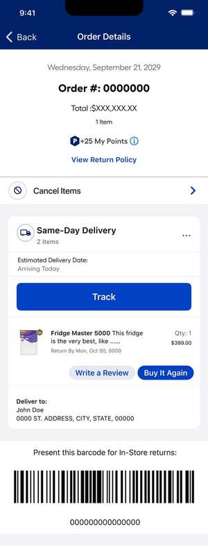
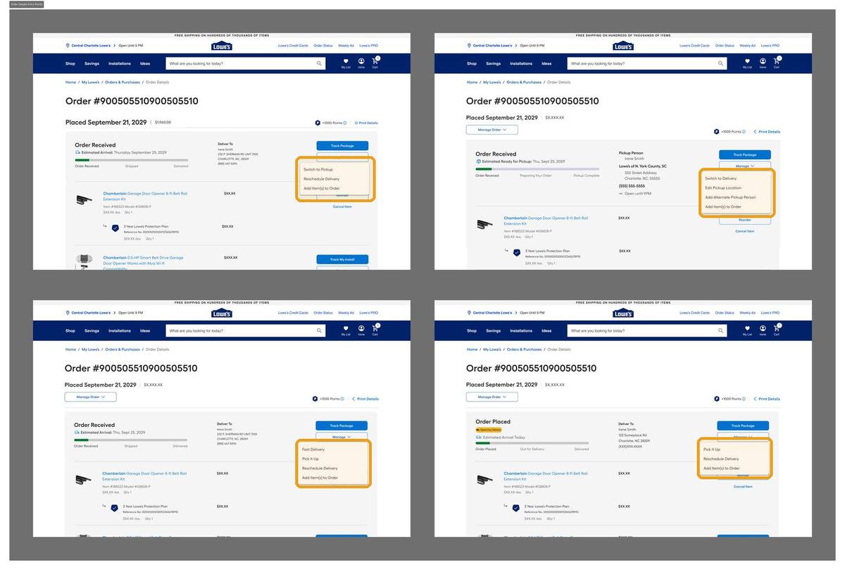
Entry 01. Order details, every fulfillment type
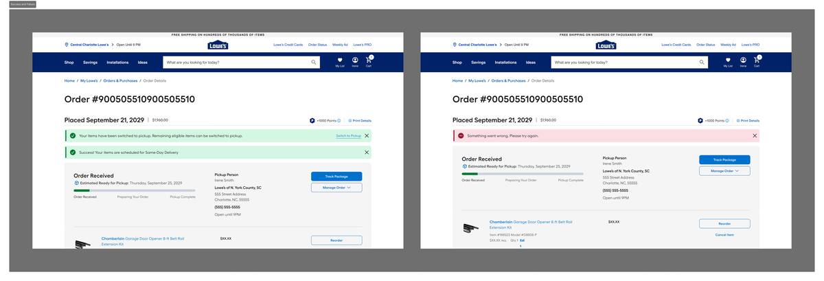
Talentverse fulfillment — entry_order
Problem
A customer opening their order to check on a delay is already at peak intent, but had no switch option there.
Decision
A "Switch to…" option inside the Manage dropdown on every order type. Delivery, pickup, and same day all get their own.
Why
Proactive recovery: catch them before frustration turns into a cancellation.
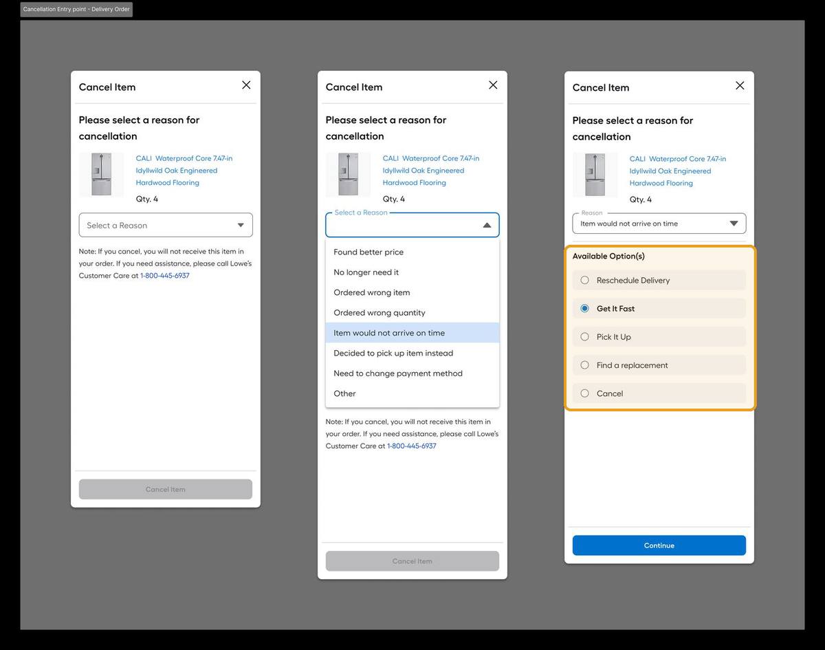
Entry 02. Inside the cancellation flow
Talentverse fulfillment — entry_cancel_delivery
Problem
By the time someone picks a cancel reason, they've told you exactly what's wrong, but the flow only offered "cancel."
Decision
Selecting "Item would not arrive on time" surfaces recovery options, Get It Fast, Pick It Up, Find a replacement, before the cancel button.
Why
The cancel reason is a research signal. Answer it with a fix, not a form.
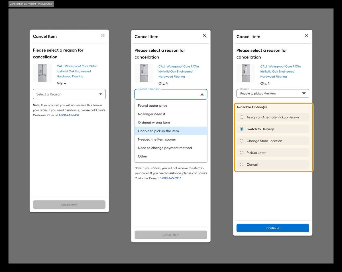
Entry 02b. Pickup orders get the mirror
Talentverse fulfillment — entry_cancel_pickup
Problem
"Unable to pick up the item" is the pickup side version of the same broken promise.
Decision
Surfaces Switch to Delivery, Change Store, Assign Alternate Pickup Person, or Pickup Later, the pickup mirror of the delivery flow.
Why
Every fulfillment method needed a way out that isn't cancellation.
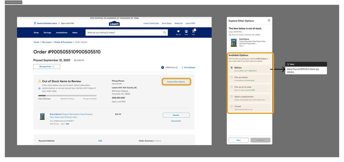
Entry 03. Out of stock recovery
Talentverse fulfillment — entry_oos
Problem
When a pickup item goes out of stock, the industry default is substitute or refund. Neither keeps the sale.
Decision
"Explore Other Options" opens the full menu. Delivery, pick up nearby, pick up when back in stock, replacement, or cancel. With a clear 3 day auto cancel fallback stated up front.
Why
The OOS wasn't the customer's fault. Give them every path to still get the item.

The switch itself

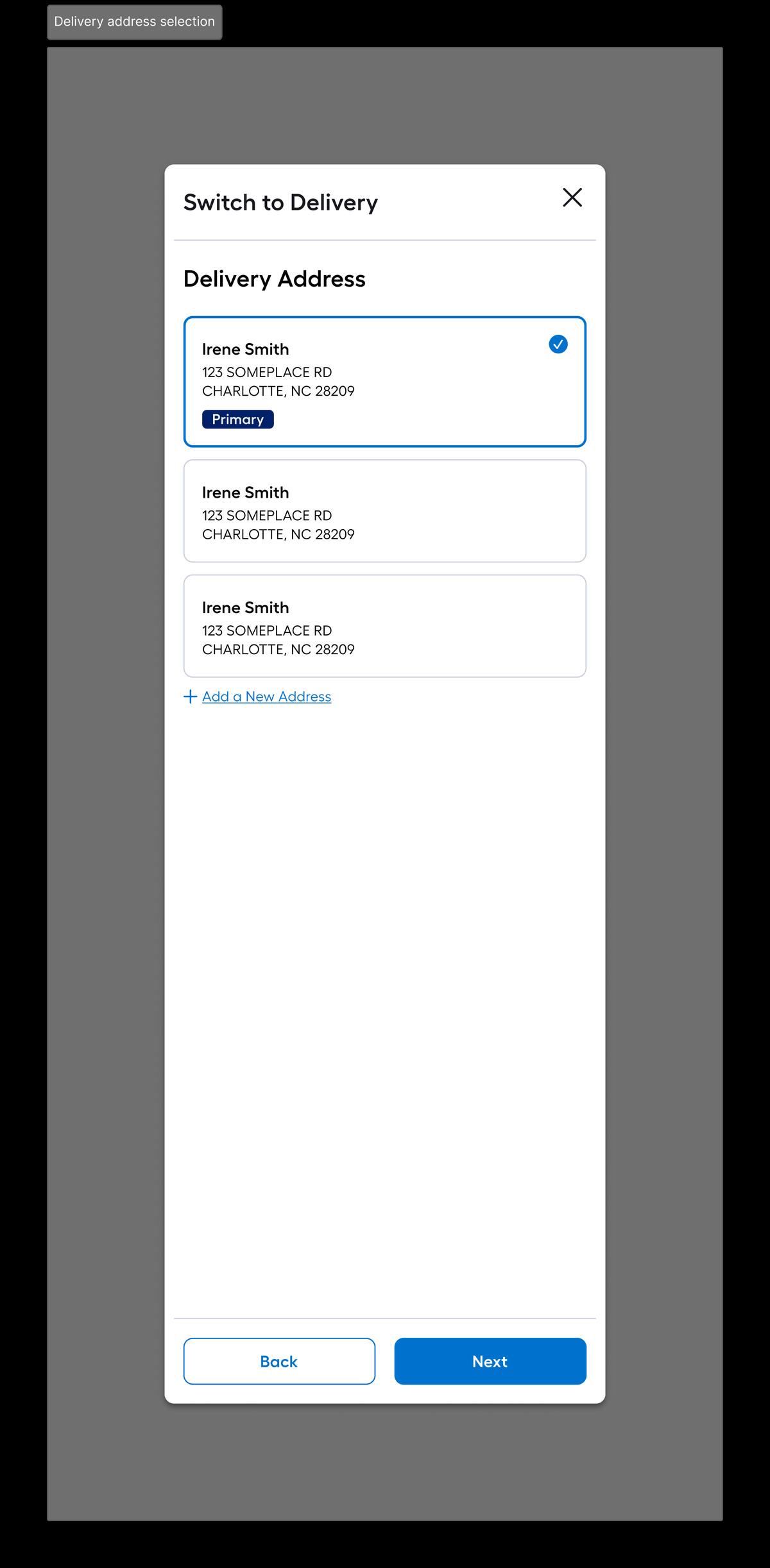
Switch 01. Address selection
Talentverse fulfillment — address
Problem
Switching to delivery needs an address. Asking for one mid recovery can't feel like starting over.
Decision
Saved addresses first (primary flagged), add new one tap away, no detour into account settings.
Why
Every extra step here is a customer who gives up and cancels anyway.
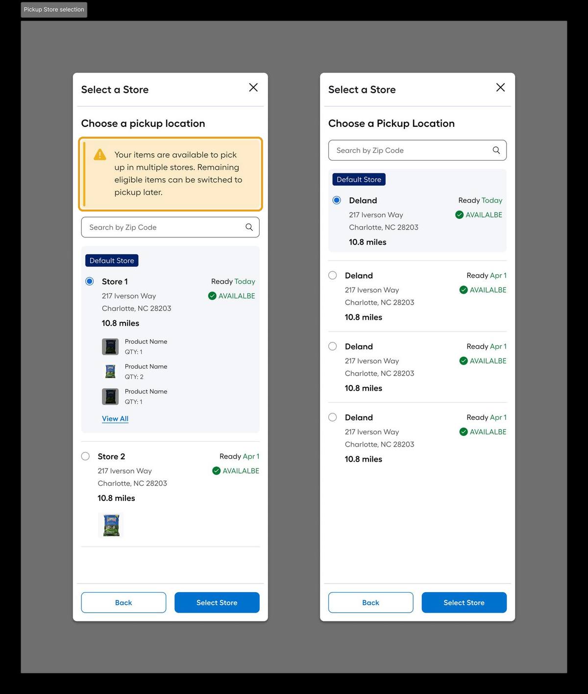
Switch 02. Store selection, multi store aware
Talentverse fulfillment — store
Problem
Sourcing may split items across stores, and "optimal" for the system isn't obvious to the customer.
Decision
Default store shown with per item availability; the highlighted callout tells the customer up front when items span multiple stores.
Why
A silent store split is exactly what triggers a second wave of cancellations.
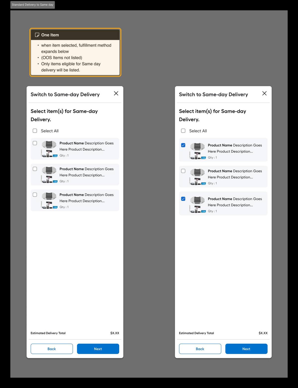
Switch 03. Delivery → Same day (eligibility aware)
Talentverse fulfillment — sameday
Problem
Not every item can go same day, and OOS items shouldn't appear as switchable at all.
Decision
Only same day eligible items are listed; OOS items are filtered out entirely, the highlighted note makes the rule explicit.
Why
Offering a switch that then fails validation is worse than not offering it.
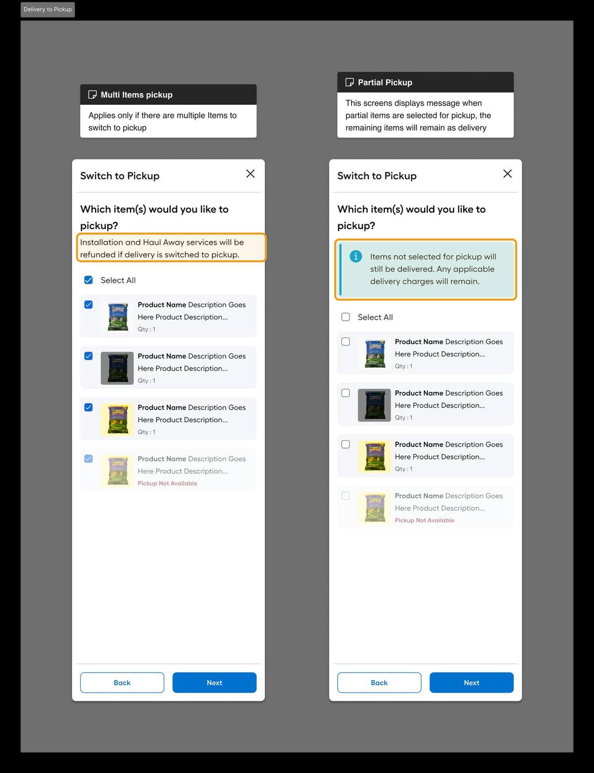
Switch 04. Delivery → Pickup (partial aware)
Talentverse fulfillment — topickup
Problem
A customer might want only some items switched, and switching can forfeit paid installation or haul away.
Decision
Item level selection with two highlighted truths: unselected items stay delivery (charges remain), and installation/haul away is refunded if switched.
Why
Partial switches are the realistic case. Hiding the trade offs erodes trust.
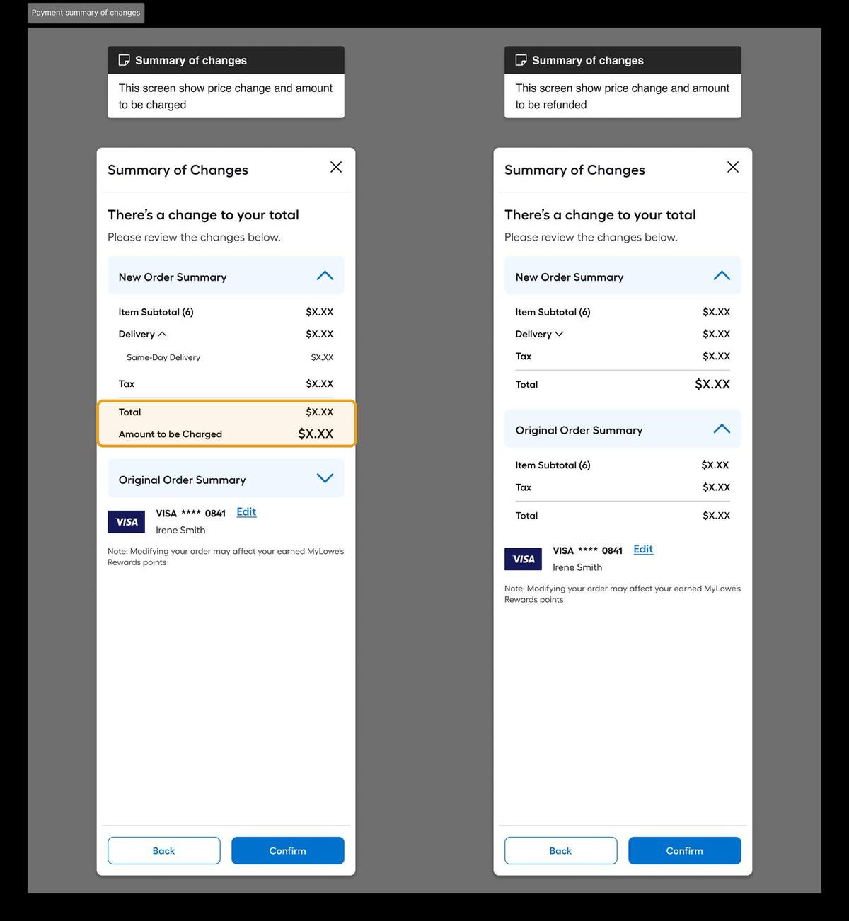
Switch 05. Payment: charge or refund
Talentverse fulfillment — payment
Problem
A switch can net to a charge or a refund depending on the new method. Including OOS triggered ones.
Decision
New vs. original order summary side by side; the highlighted line shows exactly what will be charged, or the total shows the refund. Always before confirm.
Why
A surprise charge at the end of a recovery flow undoes the recovery.
Switch 06. Success & failure
Talentverse fulfillment — success
Problem
A silent success is confusing; a dead end failure just becomes a cancellation with extra steps.
Decision
Stacked confirmations that handle multi status switches at once, and a failure state that routes back rather than dead ending.
Why
The fallback still has to be at least as good as doing nothing.
05. Trade offs

Five bets, five reasons.

01
Show the money change before confirm, never after

The bet: a switch can net to a charge or a refund depending on the new fulfillment method. Even an OOS triggered one. Surfacing the exact amount up front, rather than surprising the customer post confirm, is what protects trust. Reasoning: a hidden charge at the end of a recovery flow undoes the recovery, and directly threatens the LTR metric this was measured against.

02
Store shown before confirming, not after

The bet: naming the exact store, with address, before commit prevents a second wave of "that's not what I expected" cancellations. Reasoning: algorithmically "optimal" sourcing isn't always obviously optimal to the person receiving it.

03
Built into MyLow chat, not sequenced after web

The bet: cancellations happen in whichever channel the customer is already in. Reasoning: a web only launch would have left every chat originated cancellation completely unaddressed.

04
Three entry points instead of one central hub

The bet: customers don't go looking for a "change fulfillment" feature, you have to catch the moment they're already trying to cancel or substitute. Reasoning: intercepting at peak intent converts; a buried menu option doesn't.

05
Introduced Same Day as a real option, not just Parcel switching

The bet: some cancellations happen because even standard delivery isn't fast enough. Reasoning: ties directly to the $41M "items would not arrive on time" cancellation bucket. Parcel only wouldn't have touched it.

06, The landscape

Nobody else lets you do this.

Before designing the flow, I checked what the rest of retail actually does when a fulfillment promise breaks. The answer, almost everywhere, is the same: there is no switch. You either accept a substitute, or you cancel and start over. The self service path I was designing didn't have an obvious competitor to benchmark against, because it barely exists in the market.

Capability Amazon Home Depot Walmart Target / Instacart Lowe's. This work
Switch delivery → pickup after ordering ~
Switch pickup → delivery after ordering
Triggered from the order details page
Offered inside the cancellation flow
OOS recovery = switch fulfillment (not just refund) ~ ~
Available inside a chat / AI agent
Self service (no phone call to support)

✓ full support  ·  ~ partial / one narrow case only  ·  ✕ not offered. Cancel & re order

The detail behind the marks is where it gets interesting:

Amazon & Home Depot

Both state it plainly in their own help docs, you can't change fulfillment after ordering. Amazon routes you to cancellation; Home Depot routes you to a 1 800 number. No self service switch exists.

Walmart, the closest

The only retailer that converts delivery to pickup, but only via a text you receive when a scheduled delivery is already delayed. Not from the order page, not from cancellation, not for OOS. One narrow, passive case.

The OOS model everywhere else

Walmart, Target, and Instacart treat out of stock as a substitution problem. Accept a similar item or get refunded. Walmart now even charges for those subs. None of them offer "keep the item, change how you get it."

So the reframe from the brief wasn't just internally novel, it was a genuine gap in the category. The industry treats a broken fulfillment promise as a binary: substitute the item, or cancel the order. This work adds a third path, switch how it's fulfilled, keep the sale, triggered at the exact moments customers hit the wall, across both web and chat. That's not a polish on an existing pattern. It's a capability the largest players in the category simply don't have.

07. Impact

What it recovered.

$28.6M
total cancellations recovered. BOPUIS abandonment, OOS, and truck delivery delay combined
20%
of the truck delivery delay cancellation opportunity captured, the highest converting entry point
+100bps
Omni Fulfillment LTR. Improved independently on both the truck delivery and BOPUIS/Same Day workstreams

Broken down: $6.2M of BOPUIS abandonment cancellation saved (13% of that opportunity), $7.6M of OOS cancellation saved (13%), $8.7M of truck delivery delay cancellation saved (20%), plus a further $6.1M in additional cancellation value recovered across both workstreams.

08. Reflection

Honestly.

What surprised me: how much of what gets logged as "customer cancelled" was actually "customer gave up because we didn't offer them a real alternative." The cancellation reason dropdown had been sitting there as a research instrument the whole time, we just hadn't read it that way before.

What I'd do differently: the three entry points catch the customer in the moments they react to a broken promise. But the system often knows a delivery will slip, or a pickup item is short, before the customer does. The natural next move is a fourth, proactive entry point, a push or email that surfaces the switch before they ever open the order in worry. Turning recovery from something the customer reaches for into something the system offers first.

The uncomfortable question: is switching fulfillment always genuinely better for the customer, or does it sometimes just delay a cancellation that was going to happen anyway? We could measure "saved a sale" cleanly. We never found a clean way to separate that from "postponed a refund", and I think that's still worth someone's attention.

More from the build

The rest of the system.

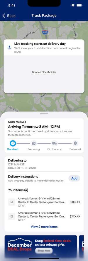
The remaining states and surfaces. Including the pre delivery Truck screen that doubles as the ETA unavailable fallback, and the same system rendered as a web drawer and a native bottom sheet.

Next case ↗

Talentverse: a talent ecosystem, designed from zero

Let's talk

Liked what you read?

adarshr49@gmail.com
← All work

03 / 04 · Lowe's · Live Order Tracking · 2025 to 26

"Where is it?" was the #1 reason people called.

Order status drove 600K+ calls a year to Lowe's contact centre, the single biggest call driver. The tracking page that was supposed to answer it told customers they were "8 stops away." I replaced a stop count with a time, then spent the next round convincing leadership to make it consistent everywhere.

Role
Product Designer. Web, mWeb & native apps
Team
PM, engineering, fulfillment ops, 3rd party logistics partners
Scope
Live tracking. Gig, then unified Gig + Truck
Status
Shipped in two releases
Key outcomes
  1. 01Replaced "8 stops away", a dispatcher's metric, with a real arrival time, on a live map that actually moves
  2. 02Shipped Gig only first under a business deadline, delivering $1.33M annualised in contact centre cost savings
  3. 03Used that result to win the argument for one consistent tracking system across Gig and Truck, the thing I'd pushed for from the start
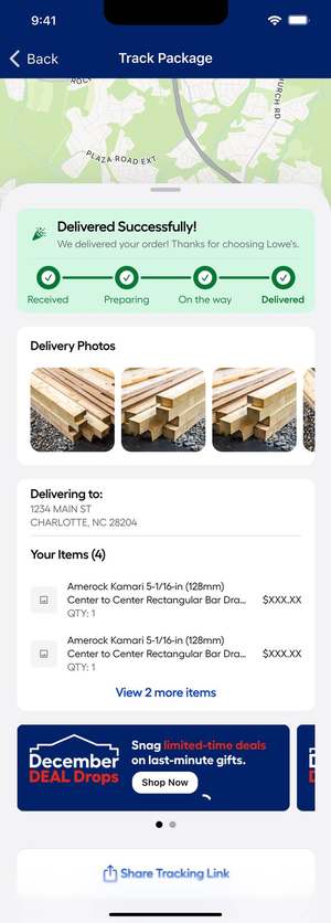
  4. 04The unified release added the states nobody asks for in a kickoff: late ETAs, missed delivery windows, proof of delivery, and add to order

03 / 04 · Lowe's · Live Order Tracking · 2025 to 26

"Where is it?" was the #1 reason people called.

This is a two release story. The first release was scoped down by the business to hit a date, it worked, and it made money. The second release was the one I'd argued for originally, and I only got it because the first one gave me the evidence. It's the clearest example I have of losing a design argument, shipping anyway, and then winning it with data.

Role
Product Designer. Web, mWeb & native apps
Team
PM, engineering, fulfillment ops, 3rd party logistics partners
Scope
Live tracking. Gig, then unified Gig + Truck
Status
Shipped in two releases
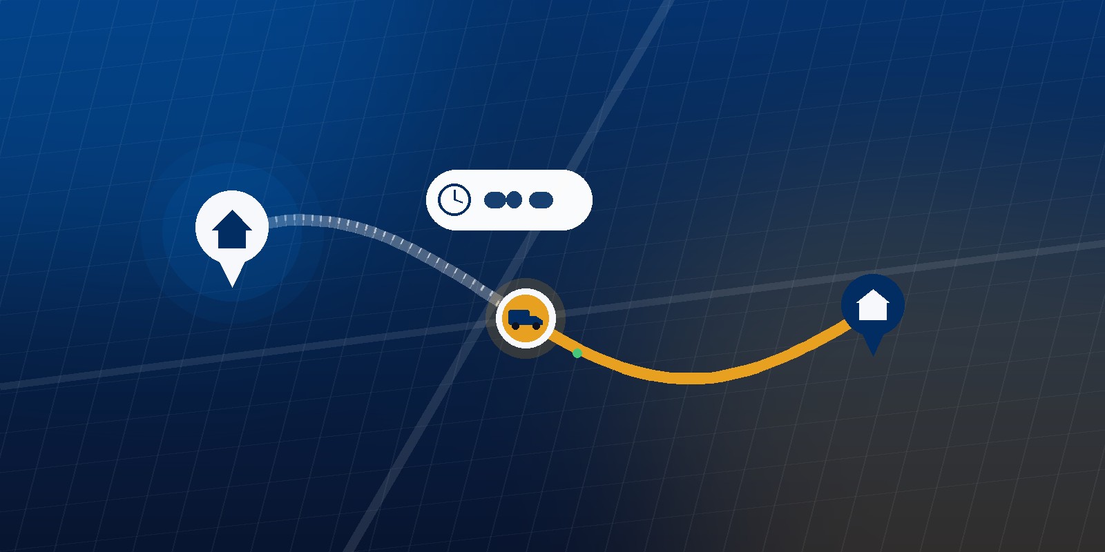
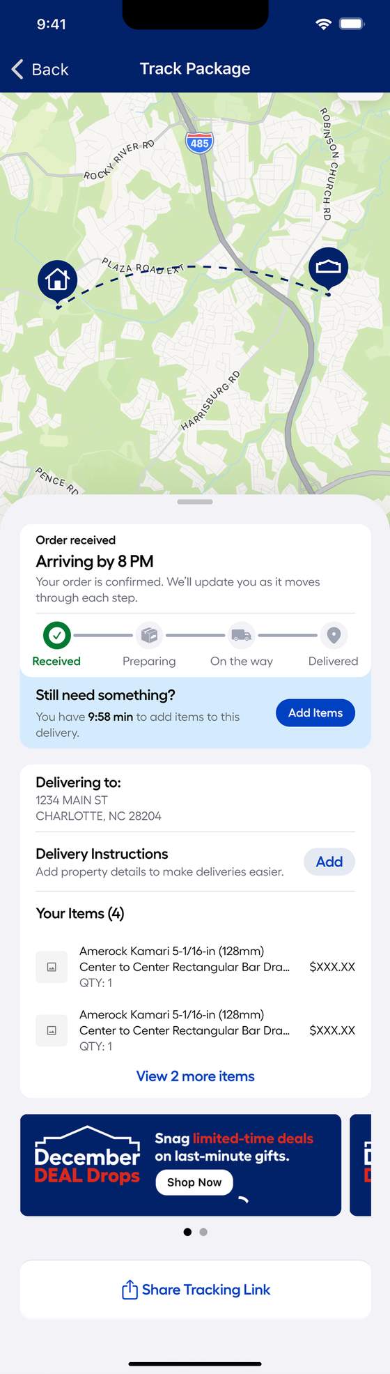
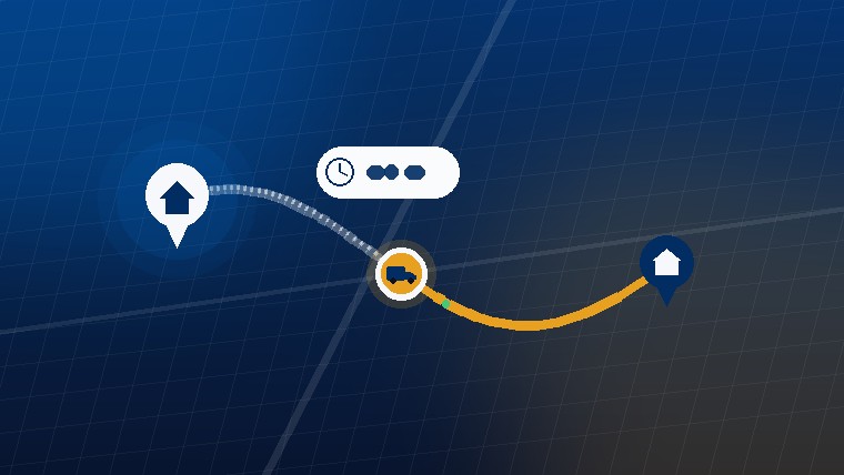
Live delivery route with vehicle in transit and an ETA
Why this matters

The page meant to stop calls was causing them.

"Order status" was the #1 intent for customers calling Lowe's contact centre. Over 600,000 calls a year. A tracking page exists to answer that question before someone picks up the phone. Ours wasn't doing it.

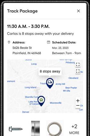
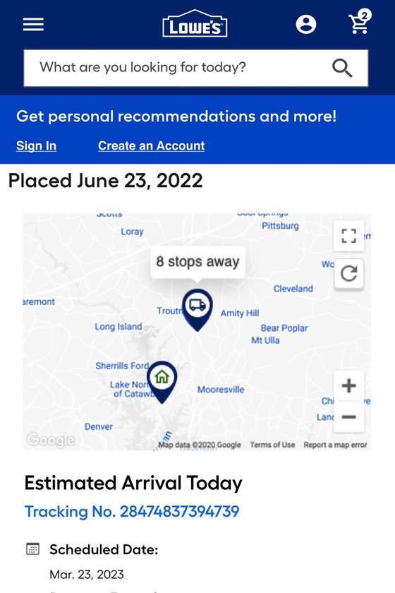
The old experience was live for Truck Delivery only, and it answered "where is my order?" with "8 stops away." That's a dispatcher's unit. It doesn't convert to time in any way a customer can predict. Eight stops could be forty minutes or three hours. The rest of the page was carrier telemetry surfaced raw: FedEx scan events, warehouse city names, a tracking number shown twice. And at the top, "Estimated Arrival Today" sat directly above a scheduled window of "7am to 9am" on a different date.

If your tracking page shows a stop count, a scan log, and two conflicting dates, it isn't deflecting the call. It's generating it.

Live order tracking — old_web
Problem
"8 stops away" is a logistics metric. The customer's question is "when."
Problem
Carrier scan events ("Arrived at FedEx location Plainfield, IN") are warehouse language shown to a homeowner.
Problem
"Estimated Arrival Today" above "Scheduled: Mar 23, 7am to 9am". Two answers, no clarity.
01. Release one

I wanted one system. I got a deadline.

The constraint

"Gig only. We need it live this quarter."

Gig was the fastest growing fulfillment method and the business wanted tracking on it now. I argued for designing Gig and Truck together, same states, same components, one system, because shipping two different tracking experiences for the same customer creates exactly the inconsistency that drives support calls. I lost that argument on timing, not on merit. So I scoped to Gig and built it to extend later.

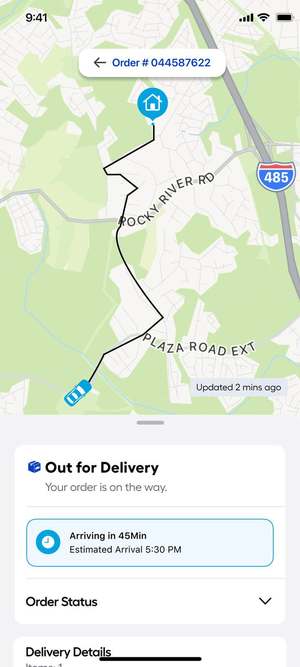
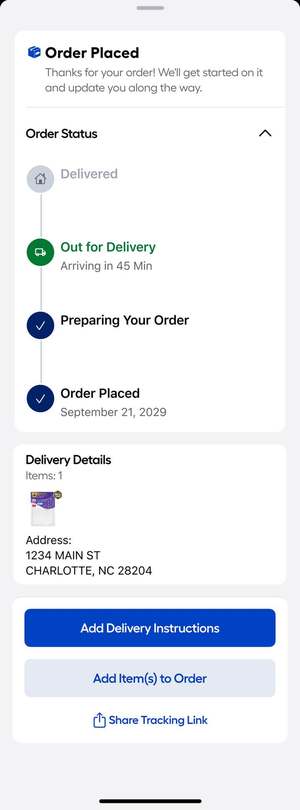
The core move was small and total: stop reporting position, start answering the question. "8 stops away" became "Arriving in 45 Min · Estimated Arrival 5:30 PM." The map went full bleed with a live route and a vehicle that actually moves, refreshing on a timer with an honest "Updated 2 mins ago" stamp. The carrier scan log became four plain states a person can read at a glance.

Before

"8 stops away" · FedEx scan events · small static map · tracking number twice

After

"Arriving in 45 Min" · live route · four customer language states · last updated stamp

Result

$1.33M annualised contact centre cost savings. Modelled on call deflection

It worked. Independent valuation put it at $1,110,887 in FY26 and $215,166 in FY27. $1.33M annualised, modelled from unique visitors interacting with tracking, adjusted for the share who historically would have called, at an $8.33 cost per call. These are soft savings: the model assumes call volume reduction frees capacity rather than cutting headcount, and it gets re forecast over 52 weeks post launch.

02, The turn

Winning the argument the second time.

Release one left exactly the problem I'd flagged: a customer with a Gig order and a Truck order saw two different tracking experiences from the same retailer. When leadership revisited it, I made the case again, but this time I wasn't asking them to take my word for it.

01
The model was already proven

Gig tracking had a measured dollar value attached to it. The ask stopped being "trust this design direction" and became "extend the thing that's already returning money."

02
Inconsistency feeds the #1 call driver

Order status was the top call intent. Two different answers to "where is it?" depending on how the order shipped is a support cost, not a design preference.

03
Two systems cost more than one

Separate flows meant duplicated components, duplicated edge cases, and double the QA surface on every future change.

04
Truck had states Gig didn't

Scheduled windows, missed deliveries, and pre delivery days had no design at all. Unifying wasn't a reskin, it was the only way those states got built.

The second release is where the work got interesting, because I finally had room to design the states that don't appear in a happy path kickoff deck.

03, The system

Four states, and everything that goes wrong.
One tracker, four plain language states, Received → Preparing → On the way → Delivered, applied identically to Gig and Truck, across web, mWeb and native apps. The interesting design isn't the happy path. It's what the same component does when the plan changes.

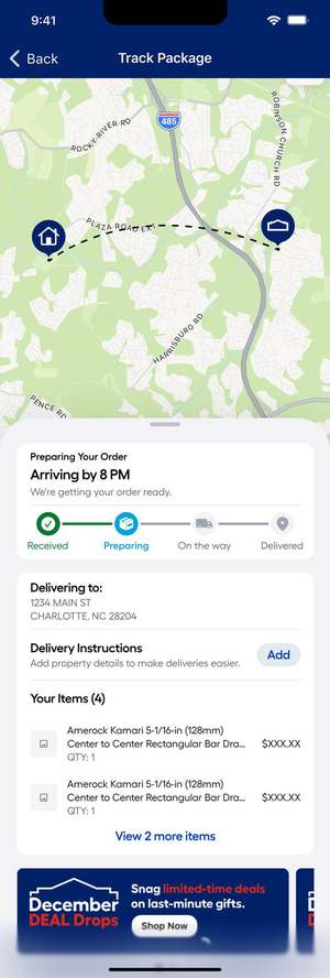
State 01. Received
Live order tracking — s_received
Problem
Before a driver is assigned there's no vehicle to show, but the customer still wants reassurance.
Decision
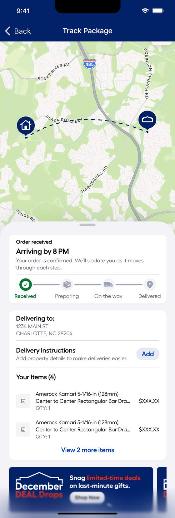
Dashed route between store and home, a committed "Arriving by 8 PM," and an explicit promise to update at each step.
Why
An empty map reads as broken. A dashed one reads as "not yet."
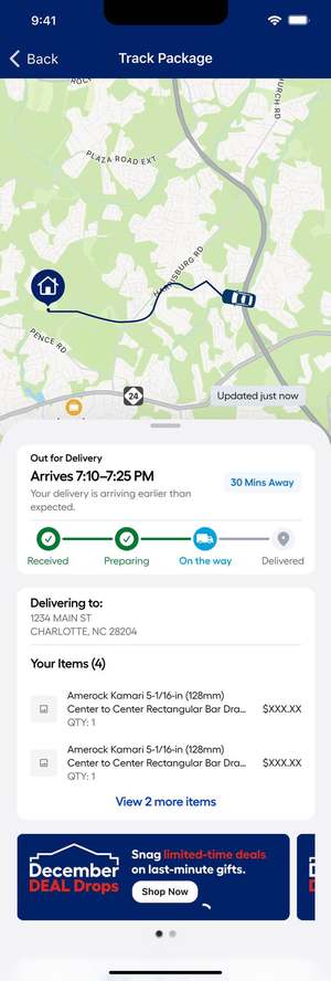
State 02. On the way
Live order tracking — s_otw
Problem
This is the moment the customer would otherwise call.
Decision
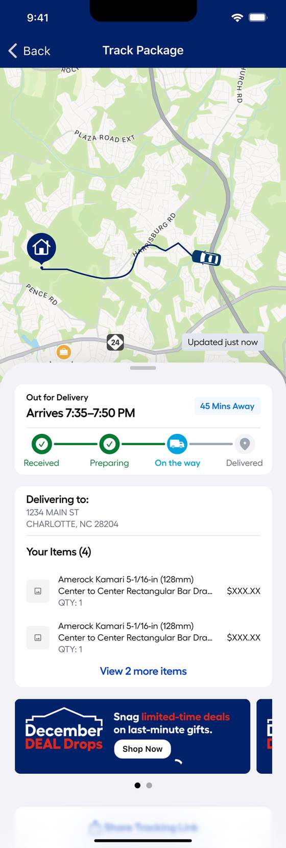
Live vehicle on a real route, a time window ("Arrives 7:35 to 7:50 PM"), a "45 Mins Away" chip, and an "Updated just now" stamp.
Why
A window plus a countdown answers "when" two ways. The timestamp tells them the data is alive.
State 03. ETA updated (running late)
Live order tracking — s_eta
Problem
A silently sliding ETA is how trust dies, and how a call gets made.
Decision
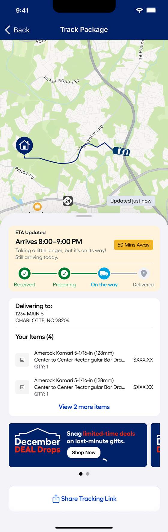
Amber treatment, an honest headline ("Taking a little longer, but it's on its way"), and the reassurance that matters most: still arriving today
Why
Customers forgive a late delivery. They don't forgive finding out late.
State 04. Truck: delivery window missed
Live order tracking — s_truck_missed
Problem
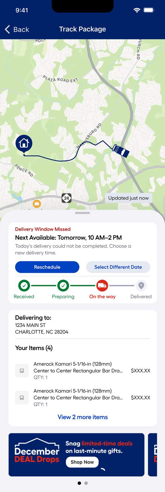
A missed window is the worst moment in the whole journey, and the old design had no answer for it at all.
Decision
Red state, the next available window offered immediately, and two recovery actions: Reschedule, or Select Different Date.
Why
The failure state is where a tracking page either saves the order or loses it. Give them the fix, not an apology.
State 05. Add items, while the window is open
Live order tracking — s_additems
Problem
Same day orders have a short window where more items can still join the run, and customers didn't know it existed.
Decision
A live countdown, "You have 9:58 min to add items to this delivery", turning tracking from a passive status page into a revenue surface.
Why
Urgency is real here, not manufactured. The window genuinely closes.
04. Impact

What it returned.

$1.33M
annualised contact centre cost savings from release one (soft savings, modelled at $8.33/call)
$2.25M
cancellation value saved, following the unified release
+100bps
fulfillment LTR, the target set at kickoff, met after unification

Worth being precise about the first figure: it's a soft saving. The valuation models call deflection against an $8.33 cost per call and assumes freed capacity gets reallocated, not cut, and it's re forecast over 52 weeks post launch. I'd rather quote it accurately than round it up.
05. What got cut

The north star we didn't ship.

Plenty of the original vision didn't survive the timeline or the third party data dependencies. Naming it honestly is more useful than pretending the shipped version was the whole idea:

Driver contact

Message or call the driver in context. Blocked on third party logistics data and privacy handling.

Proactive notifications

Push and SMS on every state change, the highest leverage call deflector, since it reaches people who never open the app.

Home screen tracking

A live order module on the app home screen, so tracking finds the customer instead of the reverse.

Also cut: an upsell rail on the tracking screen, and a multi order view for customers with several deliveries in flight. Both are still the right next moves.

06. Reflection

Honestly.

What surprised me: that losing the first argument was what won the second one. If I'd held out for the unified system at the start, we'd likely have shipped nothing that quarter and had no evidence to argue with. Shipping the scoped version bought the proof.

What I'd do differently: I'd have built the Truck states as designed but unbuilt from day one. Specced and componentised even while only Gig shipped. When leadership reversed, we'd have been weeks ahead instead of starting the second round from scratch.

The uncomfortable question: the $1.33M is a modelled soft saving, not money in a bank account. Call deflection is real, but "freed capacity" only becomes value if the organisation actually redeploys it. I can prove people stopped calling. I can't prove what that capacity went on to do.

Next case ↗

"Where is it?" was the #1 reason people called

Let's talk

Liked what you read?

adarshr49@gmail.com
← All work

04 / 04 · 0→1 Platform · Talentverse · 2022 to 2023 · Design complete, launch paused

A talent ecosystem, designed from zero

Ground up product design for a talent discovery startup. Built for performing artists and creators who don't fit neatly into Fiverr, Instagram, or Patreon. Designed end to end. Never shipped.

Role
Product Designer. 0→1, freelance
Team
Founder, me, contracted dev team
Scope
Web platform. Courses, Social, Opportunities
Status
Design complete, launch paused
Key outcomes
  1. 01Reframed the research problem first. Performing artists are one of the hardest audiences to survey, so the interviews became the marketing, not a separate research phase
  2. 02100+ artist interviews across music, dance, and visual art fed both the platform's IA and its earliest social following
  3. 03Full Courses and Social/Discovery experiences were designed end to end and handed off to development
  4. 04Funding tightened and development stalled before the build reached a shippable state, the platform never reached a real user, even though the design was complete

04 / 04 · 0→1 Platform · Talentverse · 2022 to 2023 · Design complete, launch paused

A talent ecosystem, designed from zero

Talentverse set out to be a "Digital Talent Ecosystem". One place for performing artists and creators to learn, get discovered, and get paid, instead of stitching together five different apps. I was brought on as the founding product designer, working directly with the founder to take the idea from a business plan deck to a designed, dev ready platform. It never launched. The design work, and what it taught me about designing for an audience that's genuinely hard to reach. Is still worth the read.

Role
Product Designer. 0→1, freelance
Team
Founder (Naveen Kumar A), me, contracted dev team
Scope
Web platform. Courses, Social/Discovery, Opportunities
Status
Design complete. Launch paused pre development
Talentverse — artists across music, movement, and street culture
Why this matters

Not another gig marketplace.

I've spent enough evenings on stage and enough afternoons in dance studios to know what these problems feel like from the inside, the message that never gets a reply, the gig you hear about two days too late, the sense that nobody's actually looking out for you. So when I read the founder's brief, I wasn't reading a market research summary. I recognised every line in it.

The founder's own research had already named the problem in three parts: performing artists and creative professionals lack support and direction and constantly patch together third party tools; discovering quality talent quickly for collaborations is a crowded, noisy search with no centralized platform; and creators who do get visibility are still at the mercy of algorithmic bias, trends, and platforms that own their data

None of that was unique to Talentverse's pitch deck, it was the documented state of the creator economy at the time. Industry estimates sized it at roughly $104B in 2022, the year this project started, already growing fast toward the quarter trillion mark analysts were forecasting for 2023. Independent artists were, and still are, one of the least served slices of that market: almost none of the tooling in it was built with performing artists specifically in mind.

01, The brief

The real blocker wasn't design. It was reaching the users at all.

Original brief

"Build a platform where talent finds opportunity."

Straightforward on paper. But performing artists are a notoriously hard population to research, no shared professional network the way LinkedIn serves knowledge workers, low response rates to cold surveys, and a reasonable skepticism of yet another platform asking for their time. Before a single screen could be designed responsibly, we needed real input from real artists, at a scale a founder and one designer could actually pull off without a research budget.

That constraint, no budget, no existing community, no reliable channel to reach the audience shaped everything that came after it more than any feature idea did.

02, The method

Research that also built the audience.

Instead of a survey form nobody would fill in, we designed one short, consistent interview: the same handful of questions, asked to every artist. What are you struggling with right now, what have you already tried, what would actually help. Then we posted each artist's answers as a short interview style piece on Talentverse's own social channels.

That single decision did two jobs at once. Asking the same questions every time turned scattered conversations into comparable data. Patterns showed up after a dozen interviews that a single conversation would have missed. And every interview was also a piece of content: the artist got visibility, Talentverse got a following before it had a product, and the platform's earliest community was built out of the exact people it was designing for.

Being a dancer myself helped more than I expected going in. Artists tend to open up differently to someone who's actually stood backstage waiting for a set to start, not just someone holding a clipboard, a few interviews turned into genuinely candid conversations because I could ask the right follow up question, not just the scripted one.

🎙️
Interview format
Same three questions, every artist. Illustrative example

"What's the hardest part of getting seen right now?" · "What have you already tried to fix that?" · "If one thing got easier tomorrow, what would you want it to be?". Answers ran as short social posts, one artist at a time.

IG
@talentverse_hq. Still up, still real 2,600+ followers · 300+ posts, most of them exactly this format
03, The landscape

Why not just use what already exists?

Part of making the case for a new platform was being honest about what artists were already using, and where each one fell short for this specific audience:

DiscoveryLearningMonetization
Instagram / socialReach, no filter, Indirect
Fiverr / UpworkGeneralist gigs, Direct
Patreon, , Direct
TalentverseCurated, art specificStructured coursesCommissions + IAP

No single competitor covered all three. That gap, not a clever feature, was the actual opportunity.

04. Structure & screens

Two halves of one ecosystem.

The interviews mapped cleanly onto the founder's original three problem areas, which became the brief for information architecture:

Finding

Almost every artist mentioned feeling invisible or exploited by existing platforms. Opaque algorithms, no real support

Decision

A discovery feed built around interview style profiles, not follower count ranking

Why

Directly answers the "digital disadvantage" artists kept describing

That research shaped two connected areas of the site, Social/Discovery and Courses, which became the scope of this design phase. Every artist's path through Talentverse ran along one of two tracks:

Get discovered
InterviewArtist profileApply to gigs
Grow your craft
Discover feedCourse libraryCourse detailTeach & earn
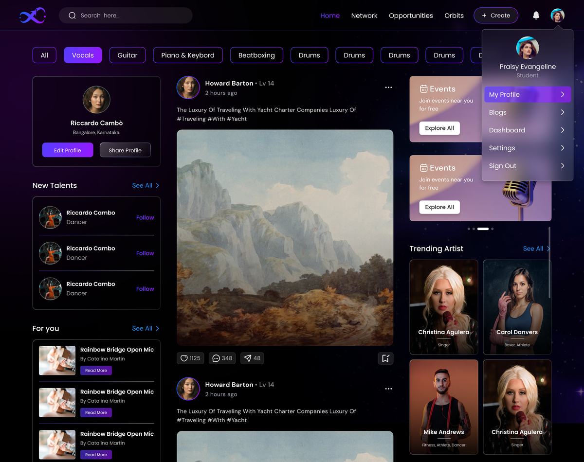
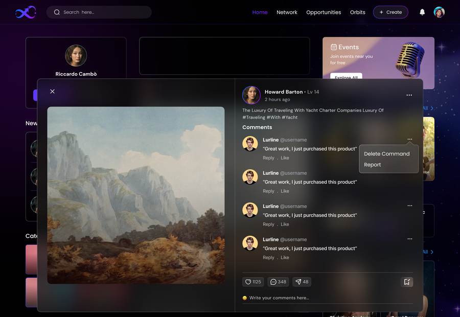
Screen 01. Discover / social feed
Talentverse discover feed screen
Problem
Standard follower count feeds reward existing reach, not talent. Exactly what artists said they were tired of.
Decision
Feed built from the interview format itself. Short artist profiles with real answers, not vanity metrics.
Why
The research method and the product surface became the same thing. Discovery that's actually about the work.
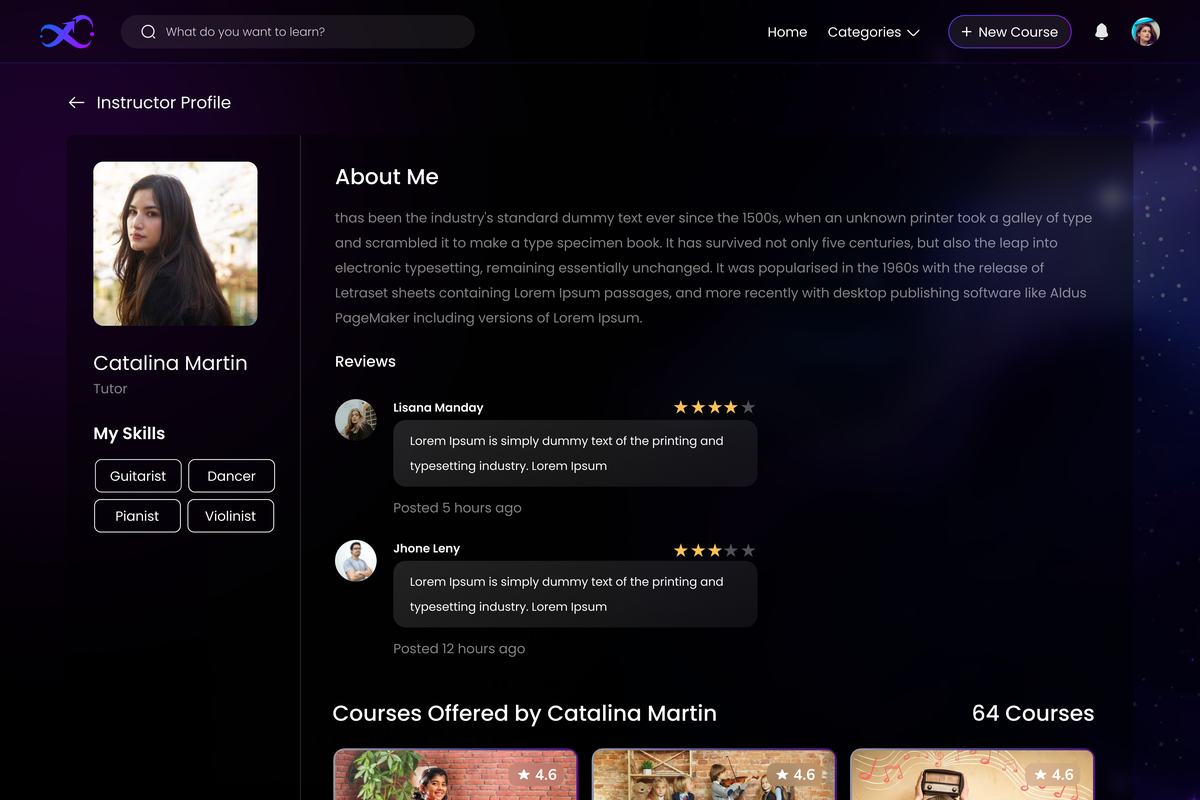
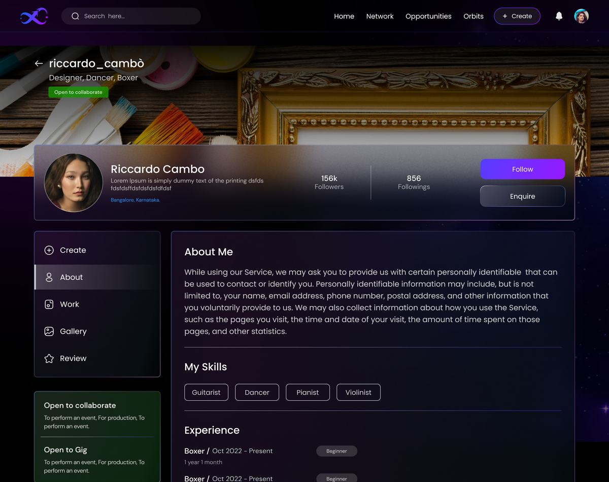
Screen 02. Instructor / artist profile
Talentverse instructor profile screen
Problem
Recruiters and collaborators said vetting talent across scattered platforms was their single biggest friction.
Decision
Profiles built around portfolio, tagged skills, and reviews. Structured for fast scanning, not a wall of links.
Why
Fast, credible vetting in one place, the "talent hunt" problem from day one of the brief.
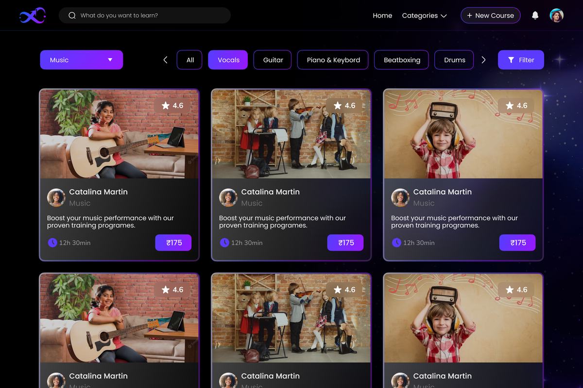
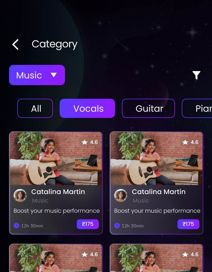
Screen 03. Course library
Talentverse course library screen
Problem
"I don't have anyone to learn from" came up almost as often as "no one can find me."
Decision
Structured course paths as a first class section, not a bolt on. Directly maps to the brand's "Advancing" pillar.
Why
An artist who can't grow their craft won't stay for a directory listing.
Screen 04. Course detail
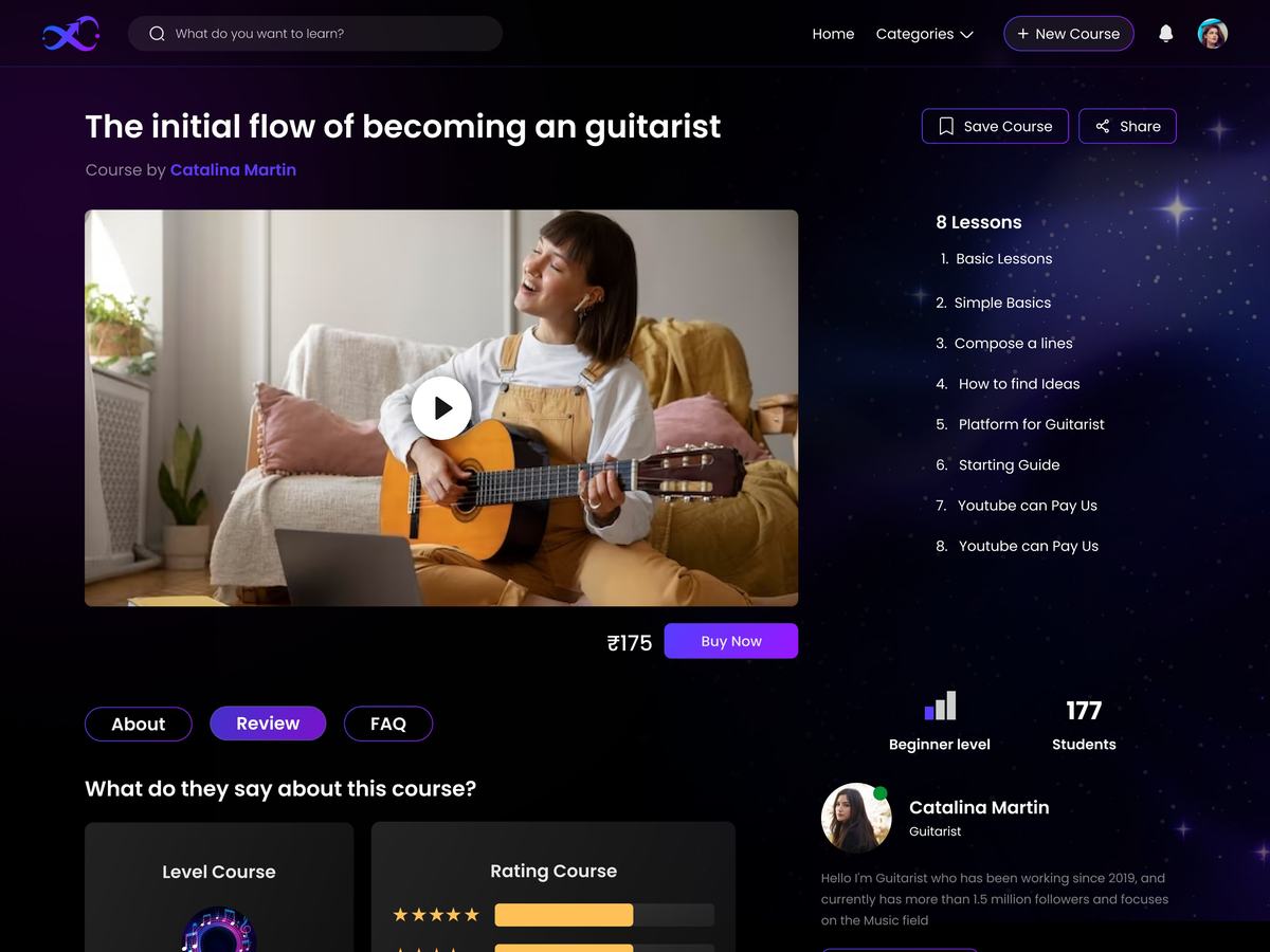
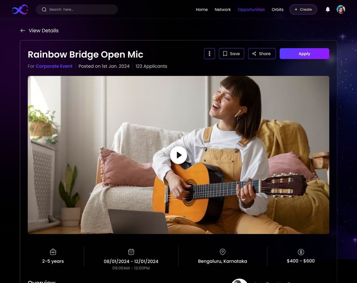
Talentverse course detail screen
Problem
Generic course pages read like SaaS onboarding. Wrong tone for a creative audience.
Decision
Applied the brand's dark, gradient led visual language and Como/Poppins type system directly into the product UI.
Why
The platform needed to feel like it was built by people who understood creative work, not enterprise software.
Screen 05. Course creation, instructor side
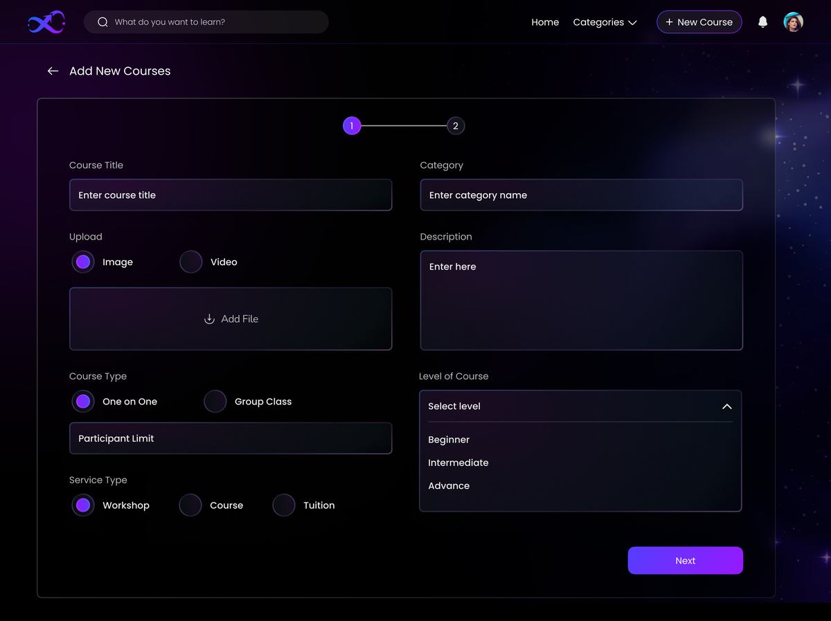
Talentverse add new course screen
Problem
Instructors had no simple way to package a workshop, course, or one on one class themselves.
Decision
A guided two step form, details first, availability and pricing second, instead of one long page.
Why
The biggest blocker to supply side growth is getting an artist's first listing live in minutes, not hours.
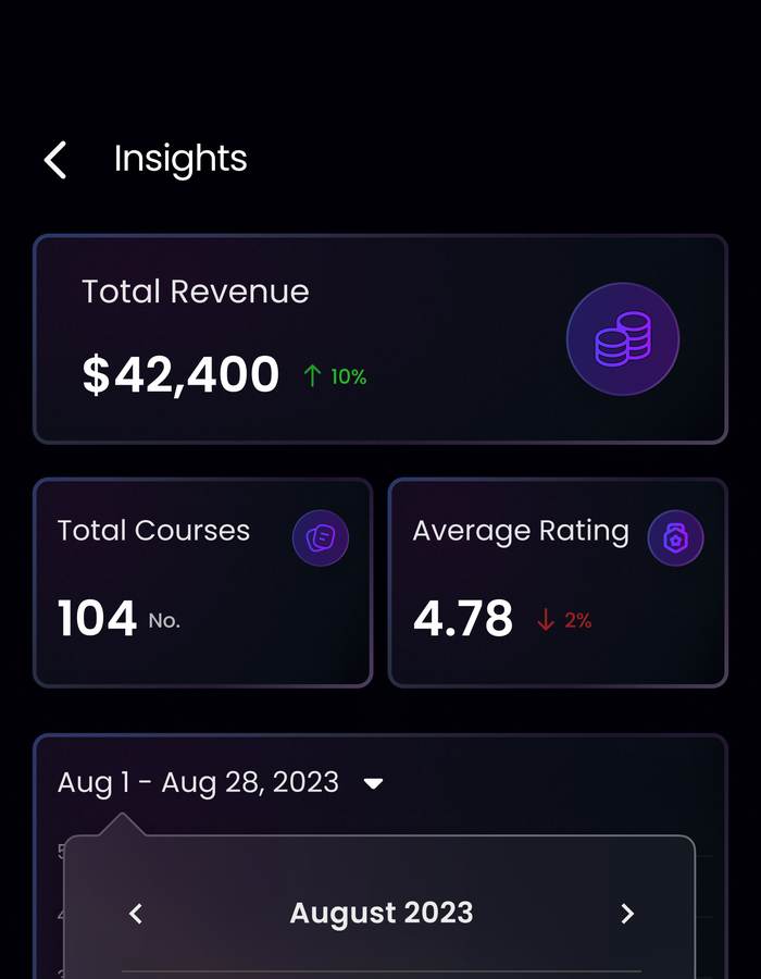
Screen 06. Creator insights & analytics
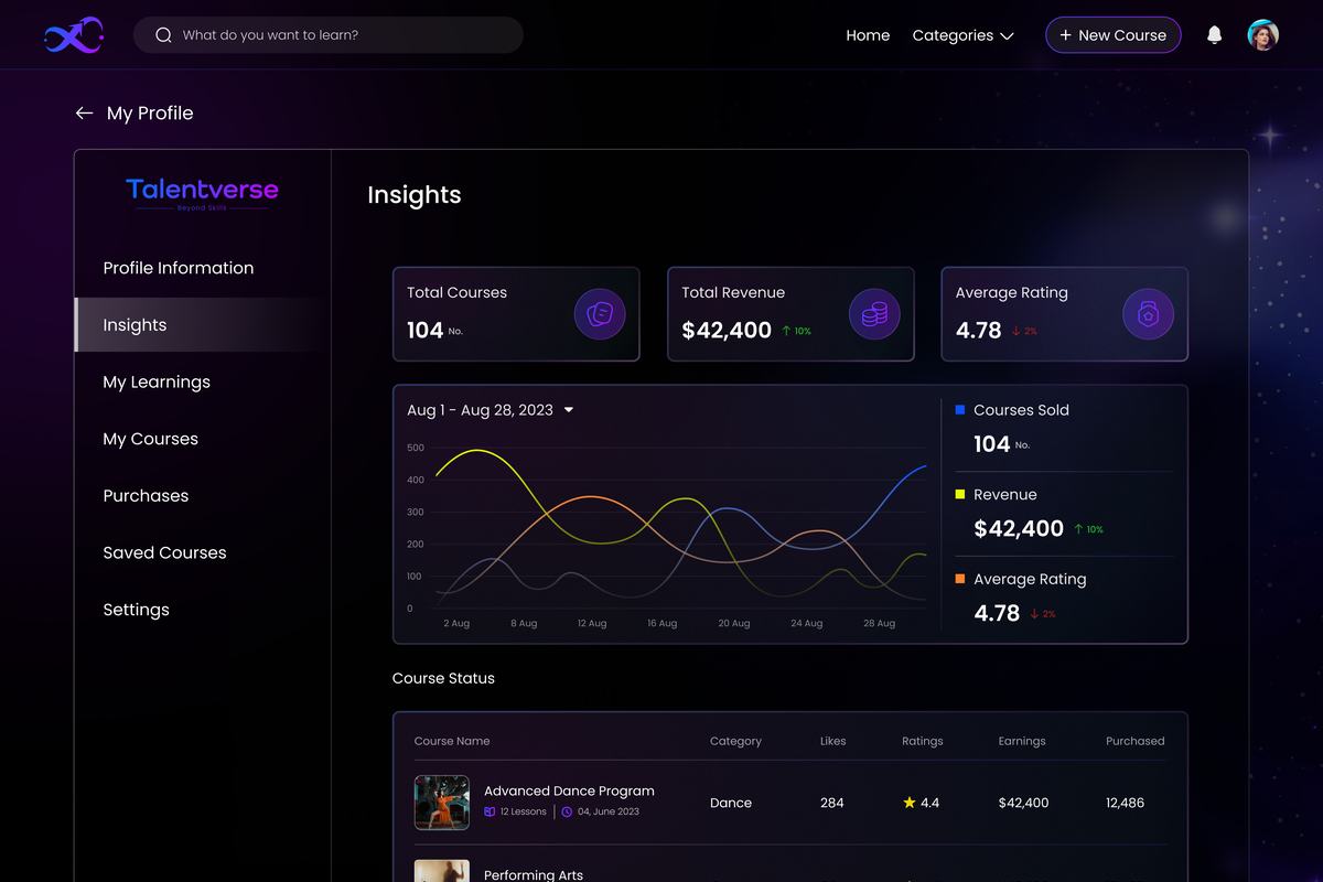
Talentverse instructor insights dashboard
Problem
Artists had no visibility into whether a course was actually working, no data, no feedback loop.
Decision
A dedicated analytics view, revenue, ratings, likes, and enrollment, per course, not just platform wide.
Why
Ties back to "talent struggles": artists said they lacked support and direction. Data is a form of both.
Screen 07. Artist / creative profile
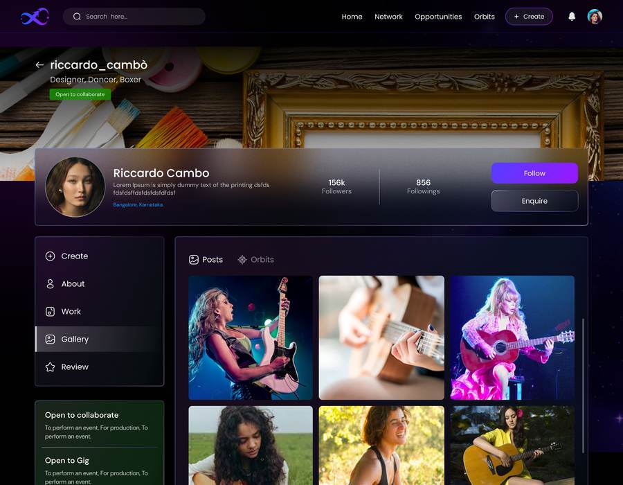
Talentverse artist profile screen
Problem
A teaching profile (instructor) and a creative profile (artist identity) are two different things. One page can't do both jobs.
Decision
A separate profile for the creative side. Skills, achievements, certificates, and "open to collaborate / open to gig" status, distinct from the course teaching profile.
Why
Not every artist on Talentverse teaches. Everyone still needs a credible, browsable identity.
Screen 08. Gig / opportunity matching
Talentverse gig opportunity detail screen
Problem
"Finding quality talent quickly for collaborations is a crowded challenge", the deck's own words for the talent hunt problem.
Decision
A dedicated Opportunities listing, pay range, dates, location, applicant count, linked straight to the poster's profile.
Why
Discovery and paid work needed to sit one click apart, not live on two different platforms.
05. Trade offs

Five bets I made. Unproven, but deliberate.

Talentverse never reached real users, so none of these have a metric attached. What I can stand behind is the reasoning:

01
Social feed over search

The bet: passive discovery mirrors how people were already engaging with interview content. Reasoning: search assumes you know what you're looking for. Discovery doesn't.

02
Dark UI over standard light SaaS pattern

The bet: matches the brand's expressive, artistic tone and reads nothing like a generic freelance marketplace. Reasoning: the audience is creative professionals, not enterprise buyers evaluating a tool.

03
Courses as a first class section, not an add on

The bet: "lack of support and direction" was the single most common theme in interviews, ahead of discovery itself. Reasoning: retention has to come from growth, not just visibility.

04
Verified profiles over follower count ranking

The bet: trust matters more than reach when someone needs to hire quickly. Reasoning: directly targets the "talent hunt" friction recruiters described.

05
Interview content as the marketing engine, not paid ads

The bet: authentic artist stories build more trust with a skeptical audience than ad spend could. Reasoning: a pre seed startup needed a channel that cost time, not money.

06. What happened

It didn't ship. Here's why.

The Courses and Social/Discovery experiences were designed end to end, full UI, a component system, and a working prototype, and handed off for development. What came after wasn't a design problem: funding tightened and the build stalled before it reached a stable, shippable state. Talentverse is currently paused rather than live, with the design and research fully intact.

I'm including this case study anyway, because the research and the design decisions behind it were real, tested against real artist input, even though the product never was.

08. Reflection

Honestly.

What surprised me: how much research design work doubles as marketing when your users are also your earliest community. The interview method blurred that line in a genuinely useful way. I hadn't designed a research method that was also a growth channel before.

What I'd do differently: formalize the interview answers into a proper research repository as we went, not just design inputs I kept in my own notes. That documentation would be worth more today than most of the screens.

The uncomfortable question: is it fair to call this a "case study" when the product never met a real user? I've included it anyway, a portfolio that only shows what shipped hides how most early stage design work actually happens, and I'd rather be honest about that than pretend every project ends in a launch.

I went into this project as a designer who happens to dance. I came out of it thinking about the two a little less separately, the instinct for knowing when a room needs something different, on a floor or on a screen, turned out to be the same instinct.

08. Where it landed

What was real.

100+
artist interviews conducted across music, dance, and visual art
2/2
core experiences, Courses and Social, fully designed and handed to development
2.6K
followers on the real @talentverse_hq account. Built entirely from interview content
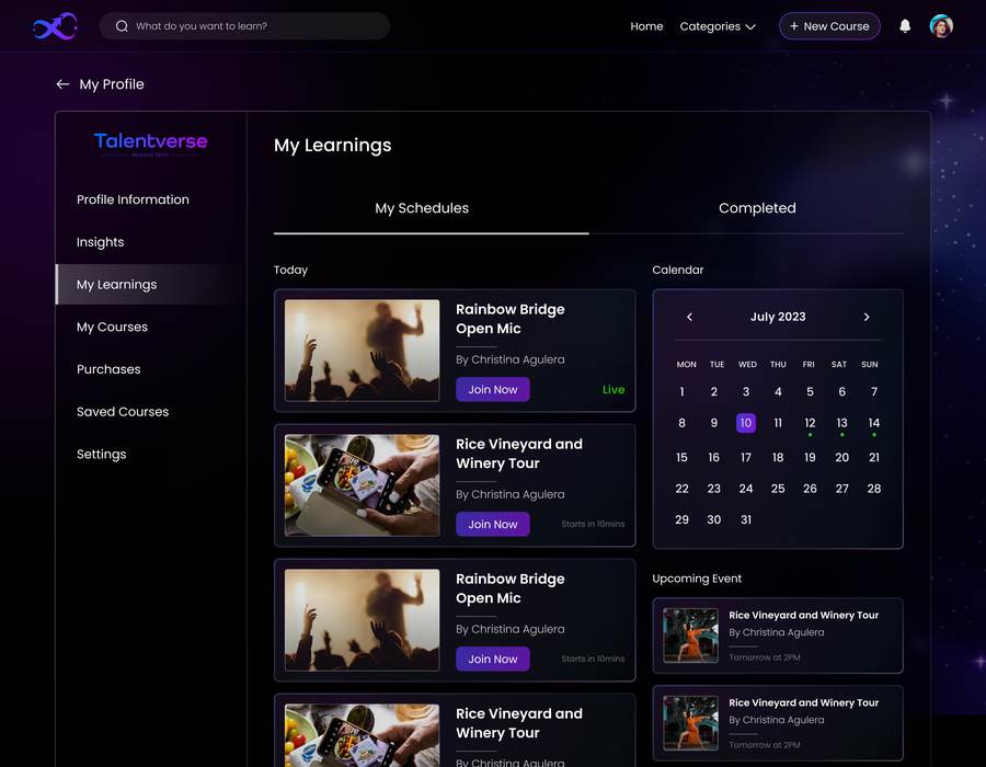
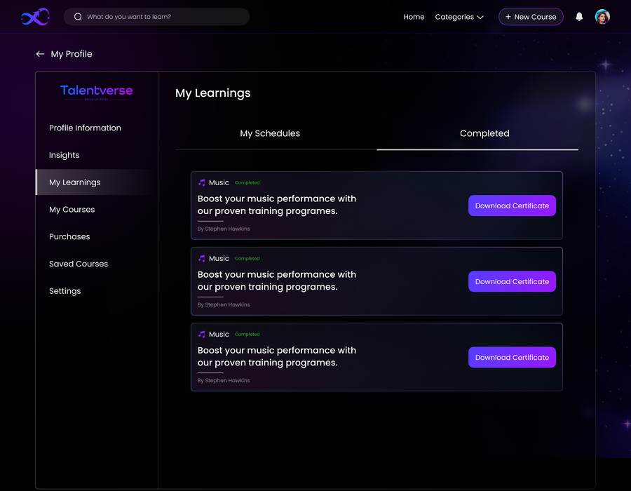
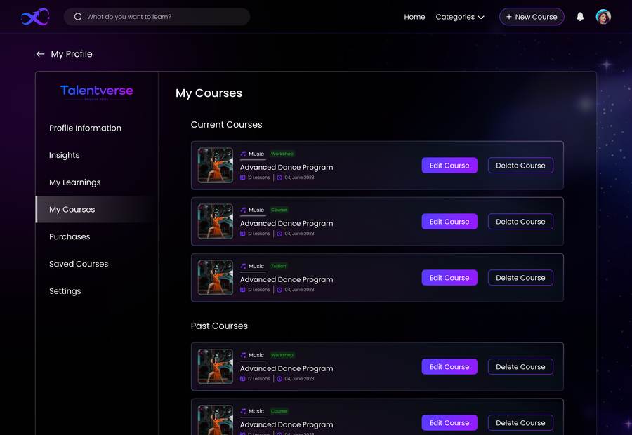
More from the build

A few more screens.

The story above covers the core narrative. These didn't make the cut, but they're real, shipped in design screens worth a glance. Live sessions, certificates, course management, and a couple of mobile views.

Next case ↗

MyLow: the AI that knows your house

Let's talk

Liked what you read?

adarshr49@gmail.com

Adarsha R

Product Designer · 6+ Years · Bengaluru

adarshr49@gmail.comlinkedin.com/in/adarsharbehance.net/adarshar_28Bengaluru · Open to remote
Experience
Product DesignerJul 2024 to Present
Lowe's · Fortune 50 Retailer · Bengaluru
  • Led end to end UX for MyLow, Lowe's AI virtual assistant, conversational UI, intent mapping, and personalisation built with OpenAI
  • Redesigned Cart, Checkout, and Post Purchase flows; +9% feature adoption, −12% avoidable order cancellations
  • Accelerated concept validation with GenAI prompt driven design and Figma Make. 3× more variations per sprint
  • Established design system components across desktop, MWeb, iOS, and Android
Product Designer. AI UXAug 2023 to Jul 2024
Excelra · Client: GSK · Bengaluru
  • Designed AI driven biomedical research interfaces for global pharma; information architecture for complex data heavy workflows
  • Design to engineering liaison in Agile/Scrum; built shared Figma component library standardising patterns across modules
UI/UX DesignerMay 2022 to Aug 2023
Metafic · Bengaluru
  • Redesigned homepage and lead gen using user research and A/B testing. −40% bounce rate, +15% qualified leads
  • Led end to end product design for B2B dashboards and logistics tools
UI/UX DesignerSep 2020 to Jan 2022
Simplilearn · Bengaluru
  • Wireframes, interactive prototypes, and high fidelity mockups for web and mobile learning experiences
  • Ran A/B tests on key UI elements, iterating on conversion and engagement data
Creative HeadApr 2019 to May 2020
Venteskraft · Bengaluru
  • Creative strategy and product page design for a stock market education startup
Selected Consulting
E Commerce UX Consultant
Wunderman Thompson · Biba, Manyavar, Nerolac Paints
  • Optimised PDPs, category navigation, and mobile first patterns across three brands
UX Designer. Talentverse & IndyMandi
Freelance
  • Talentverse: end to end UX from zero. Research, IA, onboarding, matching logic, dashboards
  • IndyMandi: marketplace redesign via competitive analysis and usability testing
Core Skills
Design
End to End Product DesignInteraction DesignDesign SystemsInformation ArchitectureWireframing & Prototyping
Research
User ResearchUsability TestingA/B TestingJourney Mapping
Collaboration
Agile / ScrumDeveloper HandoffStakeholder Management
Tools
FigmaFramerSketchMiroJiraNotionAdobe Suite
Education
Bachelor of Computer Applications
New Horizon College · BCA2012 to 2015
PUC. Science
Cambridge College2010 to 2012

Want a copy, or want to talk through any of it?

Get in touch →
Let's talk

Hiring, or just curious?

adarshr49@gmail.com

Bengaluru, India · Open to full time · 6+ years

Designer by trade.
Performer by instinct.

I'm Adarsha, a product designer with six plus years across enterprise retail, global pharma, fashion e commerce, and B2B. I design things that hold up. Research led, outcome oriented, built for the person using them, not the portfolio showcasing them.

Adarsha R
The story

Composition under constraints.

That's what both music and product design taught me. You have a brief, a constraint, a problem that resists easy solutions. The work is figuring out what to include and what to ruthlessly leave out.

I design end to end: research, IA, design systems, developer handoff. From Lowe's (Fortune 50) and GSK via Excelra, to fashion e commerce for Biba and Manyavar, to growth work at Metafic and Simplilearn

I like data informed decisions and shipping things. And I have a low tolerance for design that exists only to look good in a portfolio. The irony of saying that here is not lost on me.

How I work

What you can count on.

I ask the boring questions first. Why? For whom? What does success look like?

I design in the open. No big reveal moments. I share rough thinking early and would rather be redirected in week one than week six.

I work cross functionally by default. Design to engineering bridge on multiple teams. I write acceptance criteria and speak product and engineering.

I think in outcomes, not outputs. A finished Figma file is not the goal. A measurably better experience is.

Off the clock

The rhythm department.

Outside Figma: dancer, beatboxer, photographer. Not a fun facts footnote. This is where my design instincts come from.

Beatbox taught me to build complex systems from one constrained instrument, in real time. Dance is interaction design with your whole body. Photography is one decisive frame, the discipline of knowing what to leave out. Strip the labels: it's all rhythm, restraint, and knowing what to leave out. Most of product design too.

🩰

Dance

Motion, flow, choreography. Interaction design with your whole body.

🎤

Beatbox

Complex sonic systems from one constrained instrument. Real time. No room for error.

📷

Photography

One decisive frame. The discipline of knowing exactly what to leave out.

psst. Type "drop" anywhere to drop the beat ↓

The path

Where I've been.

2024 to nowProduct DesignerGenAI UX · Cart & Checkout · MyLow AILowe's · F50
2023 to 2024Product Designer, AI UXBiomedical research interfacesExcelra · GSK
2022 to 2023UI/UX DesignerHomepage, B2B dashboards, logisticsMetafic
2020 to 2022UI/UX DesignerWeb & mobile learning, A/B testsSimplilearn
2019 to 2020Creative HeadCreative strategy & product designVenteskraft
Toolkit

What I work with.

Design

End to End Product DesignInteraction DesignDesign SystemsInformation ArchitectureWireframingPrototyping

Research

User ResearchUsability TestingA/B TestingJourney Mapping

Tools

FigmaFramerMiroJiraAdobe Suite

Ways of Working

Agile / ScrumDeveloper HandoffStakeholder ManagementCross functional
Hiring, or curious?

Let's work on something real

adarshr49@gmail.com